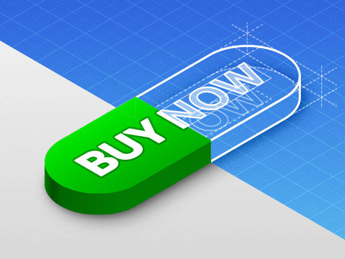
Buy: Case Study
Case Study • UX/UI • Marketing • Website
A Case Study from the Beko website
The “Buy Now” button is the single most critical touchpoint on any product sales website — the moment everything else is designed to lead toward.
Yet despite its importance, the existing implementation on the Beko site was underperforming its potential. This case study documents the reasoning and research behind a targeted redesign of that element: what was wrong, why it mattered, and how the changes made addressed it — with measurable impact on the most fundamental function the site exists to perform.
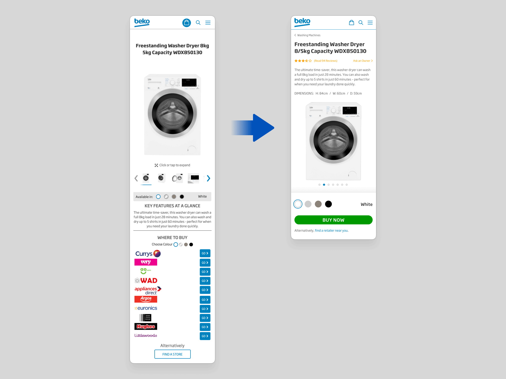
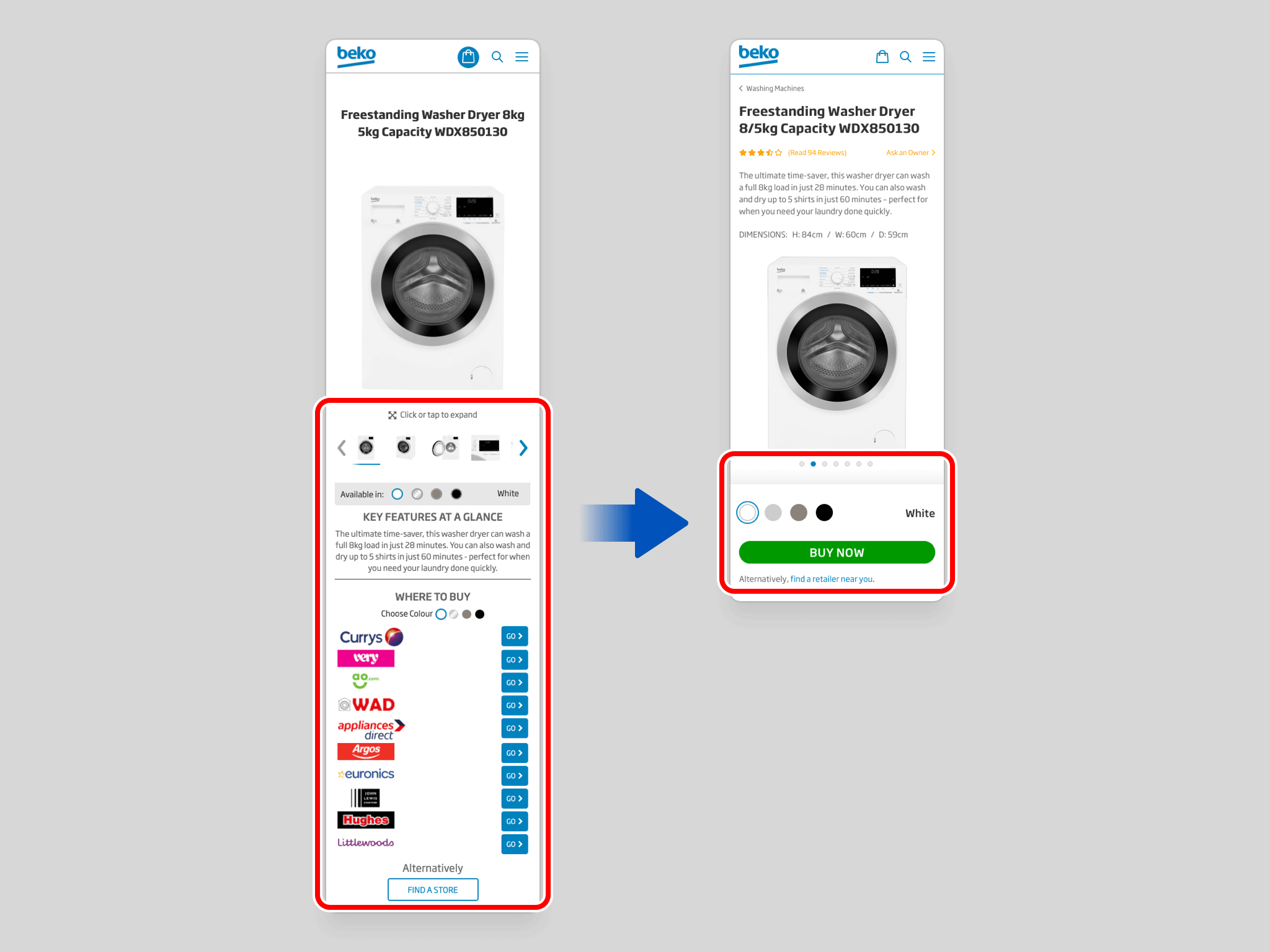
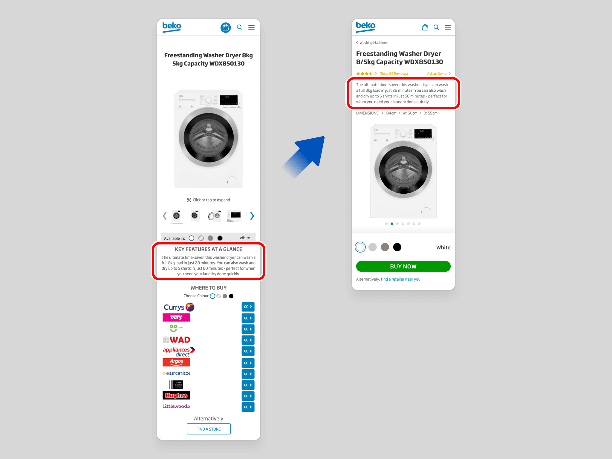
Showing the "Before Redesign" state on the left, and the "After Redesign" state on the right.
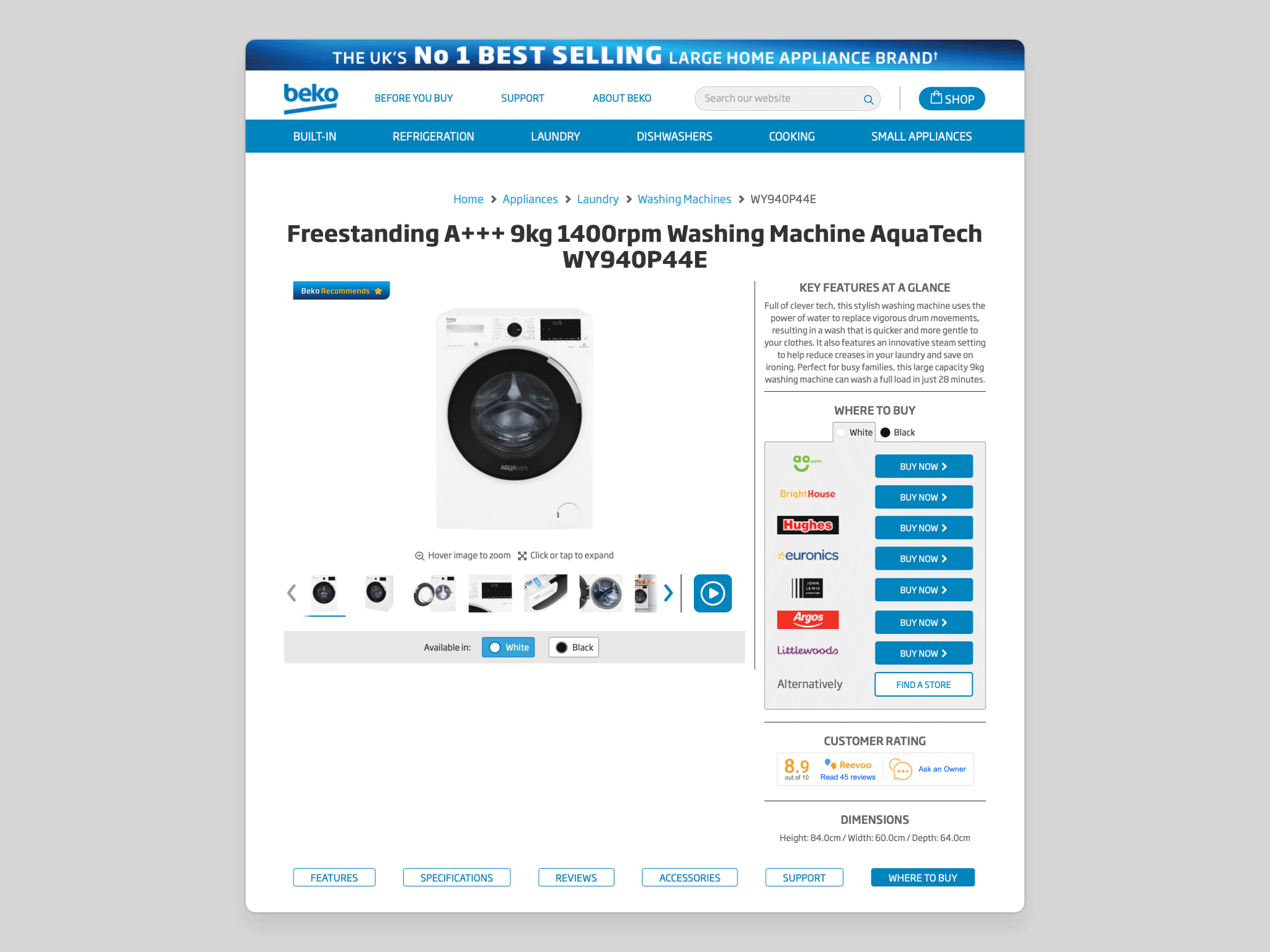
Among a broader set of refinements to purchasing, the most significant change is the consolidation of the entire and overwhelming WHERE TO BUY section into a single, focused BUY NOW button.
The existing design placed unnecessary cognitive load on the customer — too many options, too much visual noise, and too little clarity at the most critical moment of the purchase journey. A more decisive experience benefits both the customer and the retailer they convert through. The rationale is grounded in three well-established principles of UX design:
Progressive / staged disclosure is an interaction design technique in which only the most essential information and actions are presented at the point of first contact, with secondary considerations reserved for a subsequent step. By reducing what the user must process upfront, it focuses attention where it matters most.
This approach is particularly effective on mobile, where screen space is limited, browsing tends to be more casual, and attention spans are shorter. Applied here, it allows the user to decide what they want to do first (purchase the product) before being asked how (from which retailer), keeping each decision simple and sequential.
Hick’s Law establishes that the time taken to make a decision increases logarithmically with the number of available options. More choices means longer deliberation — and a higher likelihood of no decision at all.
This is intuitive, yet frequently overlooked when stakeholders want to surface every possible option simultaneously. The goal is not to eliminate choice, but to streamline the path to it — presenting options at the right moment, rather than all at once.
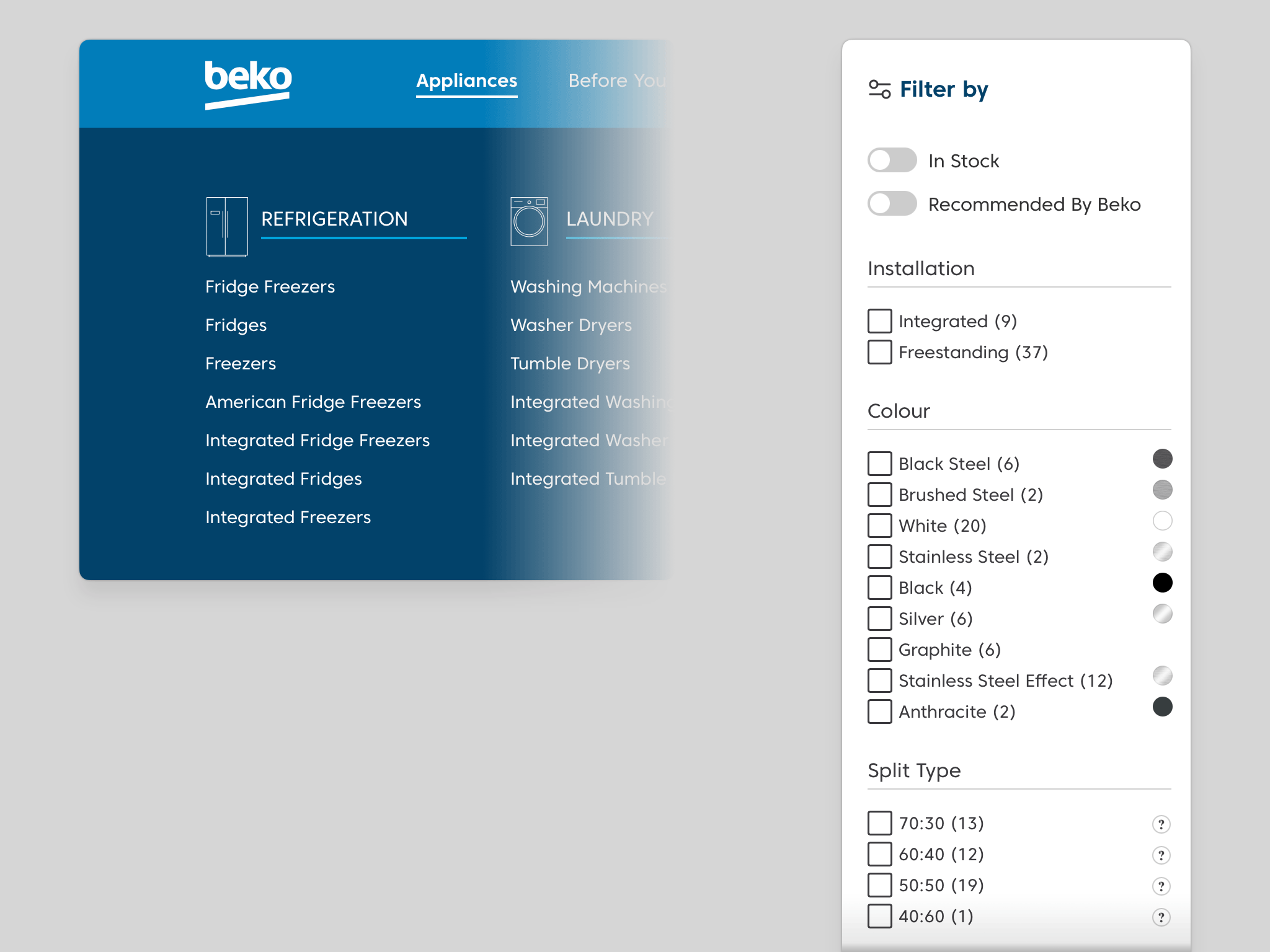
Showing the main Navigation dropdown on the home page (left), and the Filter sidebar on a product-grid page (right).
Counterintuitively, presenting users with more options doesn't empower them — it often paralyses them. Research consistently shows that reducing the number of simultaneous choices significantly lowers decision anxiety and increases the likelihood of conversion. Less clutter, more clarity.
In the existing design, every retailer button carries equal visual weight, making them all competing for the same attention simultaneously. There should be one unambiguous action that leads the eye — and the user — forward.
“Less, but better.”
– Dieter Rams
“Perfection is achieved, not when there is nothing more to add, but when there is nothing left to take away.”
– Antoine de Saint-Exupery
This principle is already applied effectively elsewhere on the site; the Refrigeration navigation, for instance, first presents an overview of all Fridge Freezers, then allows refinement through filters on the following page. The same logic applies here.

The redesign introduces an additional step into the purchase flow — but the widely cited “three-click rule” has no basis in evidence. Research consistently shows that the number of clicks required has no meaningful impact on either user satisfaction or task completion rates.
Studies show that what actually determines a successful journey is the quality of navigation, well-labelled pathways, and a consistent sense of forward momentum. When users aren't made to think about the clicks, they neither notice nor mind the extra one.

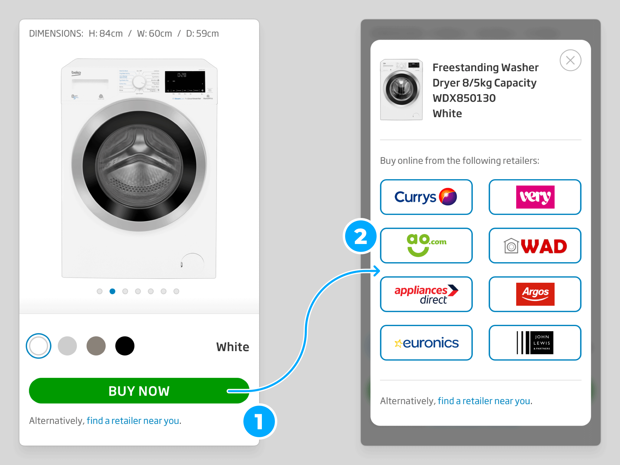
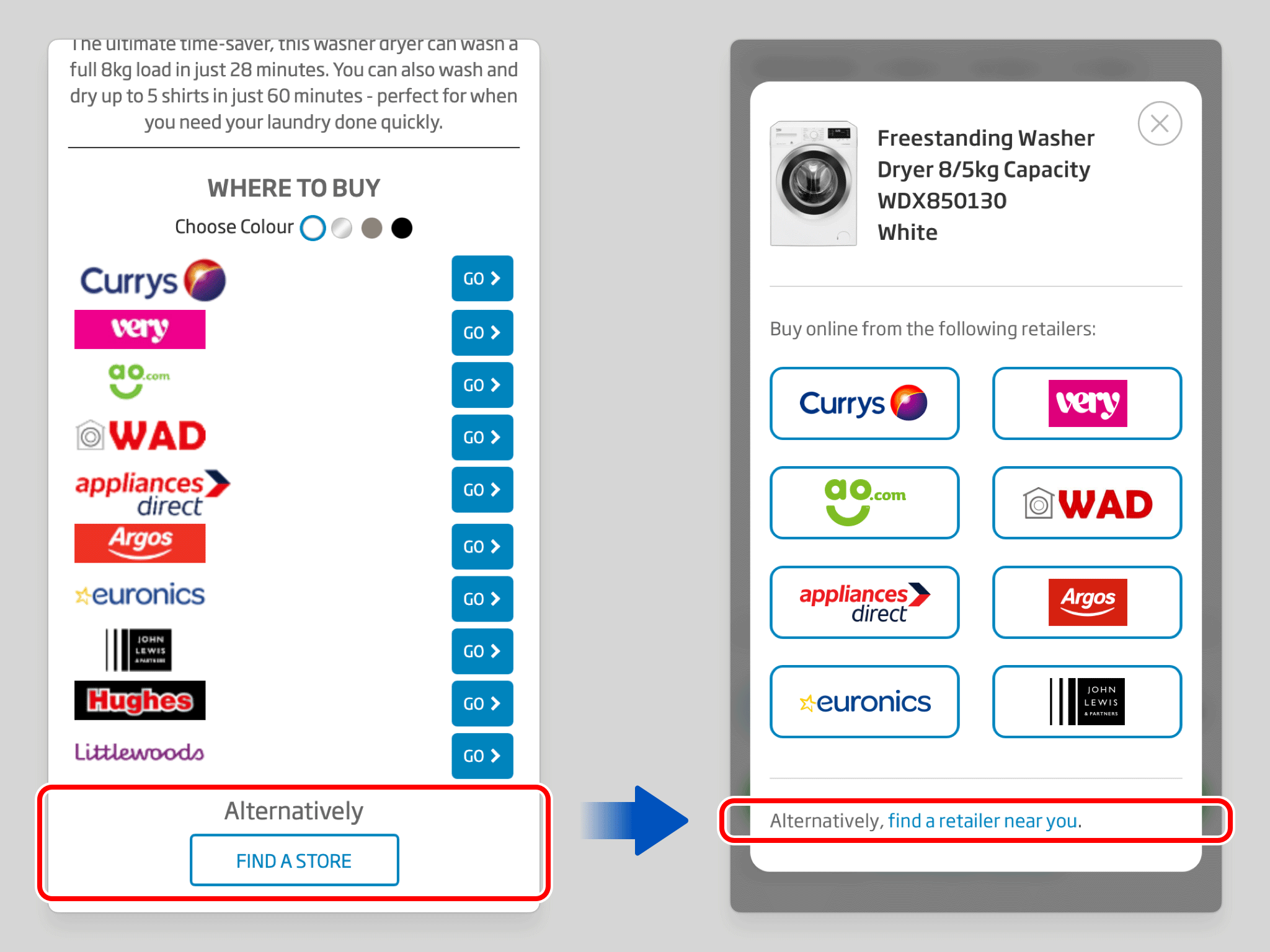
Where multiple retailers carry the product, pressing the BUY NOW button triggers a modal overlay presenting each available option. The decision of where to purchase is handled cleanly at this second stage, without cluttering the main product page.
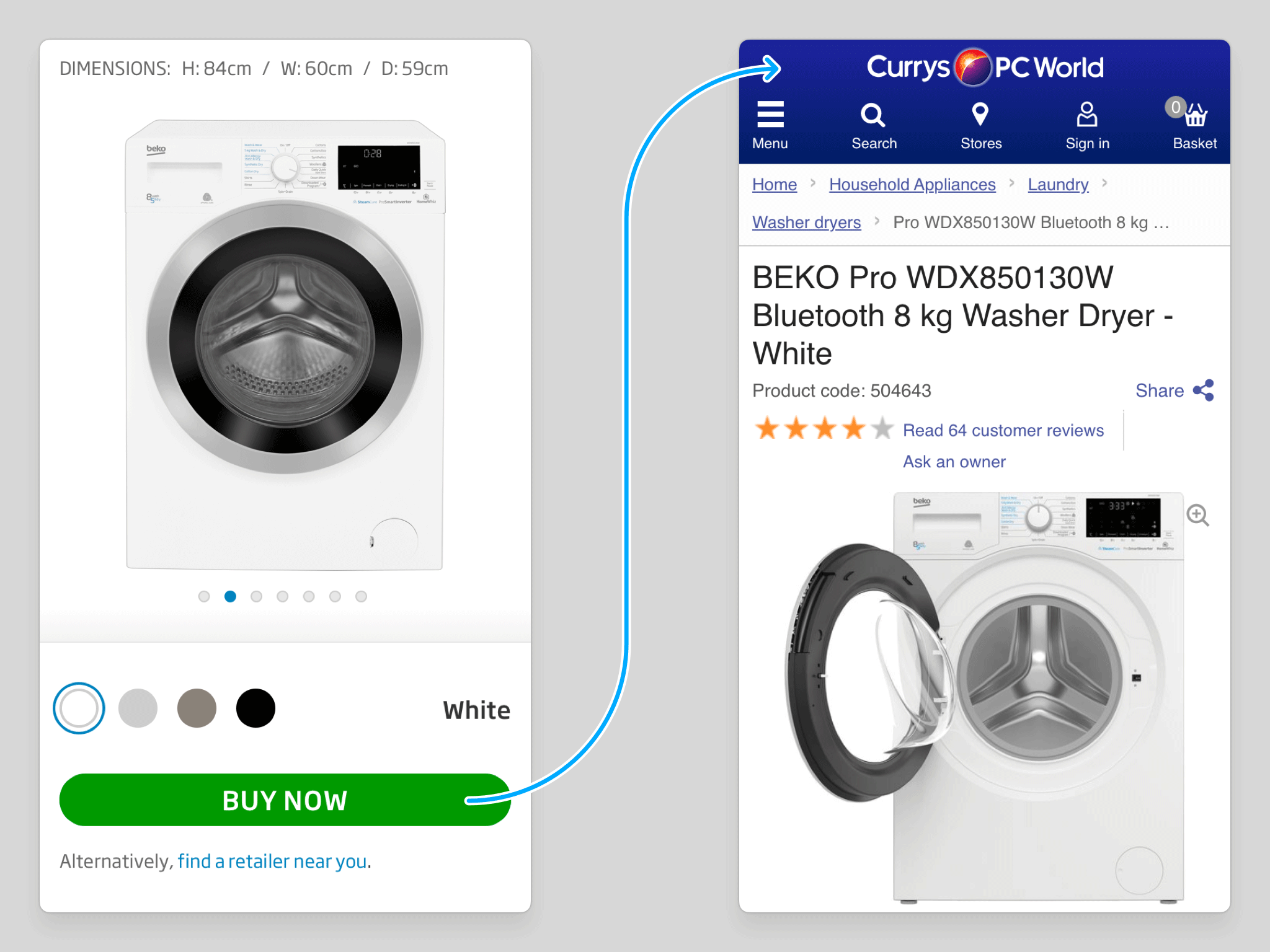
Where only a single retailer is available, the BUY NOW button routes the user directly to that retailer's site. With just one option at the second stage, an intermediary modal serves no purpose — so it is bypassed entirely, and the path to purchase is as direct as possible.

Where a product is out of stock, the BUY NOW button is replaced with a clear unavailability message, accompanied by a recommendation for an equivalent model in the same colour. Rather than presenting a dead end, the interaction keeps the user engaged and on-site — reducing frustration and preserving the opportunity to convert.
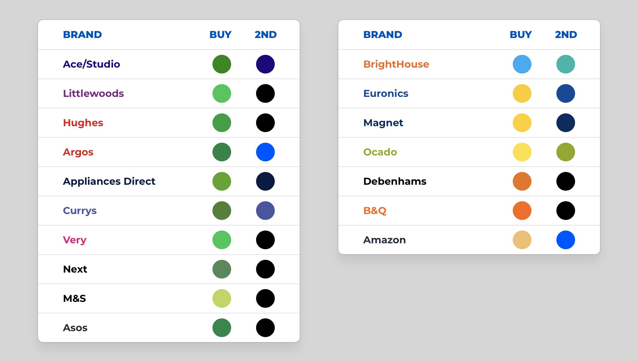
Showing competitor's website colours, where they use green for their Buy CTA (left), and where they use a contrasting colour to their secondary colour, even if not green (right).
The BUY NOW button is now rendered in green — a colour with strong, culturally embedded associations with forward movement, confidence, and permission to act. Its role in everyday visual systems (traffic signals, safety signage, check icons) is overwhelmingly affirmative.
That said, the specific colour matters less than the principle behind it: contrast. The button's effectiveness derives not solely from green itself, but from how decisively it differs from everything else on the page — establishing a visual hierarchy that separates the action that matters most from all secondary elements around it.
In the existing design, there is no discernible focal point at the moment a user is ready to act. A useful diagnostic: half-close your eyes until the page blurs enough that text becomes illegible. In that state, the purchase CTA — rendered in the same blue used extensively across the rest of the page — dissolves into the surrounding interface. Nothing commands attention because everything competes for it equally.

Apply the same blurred-vision test to the redesigned layout, and the result is immediate: a single point of focus, unmistakable even without legible text. The green BUY NOW button stands apart through colour, and benefits from an increase in size that the previous multi-button layout made impossible. Both factors compound to produce a CTA that is genuinely hard to overlook.
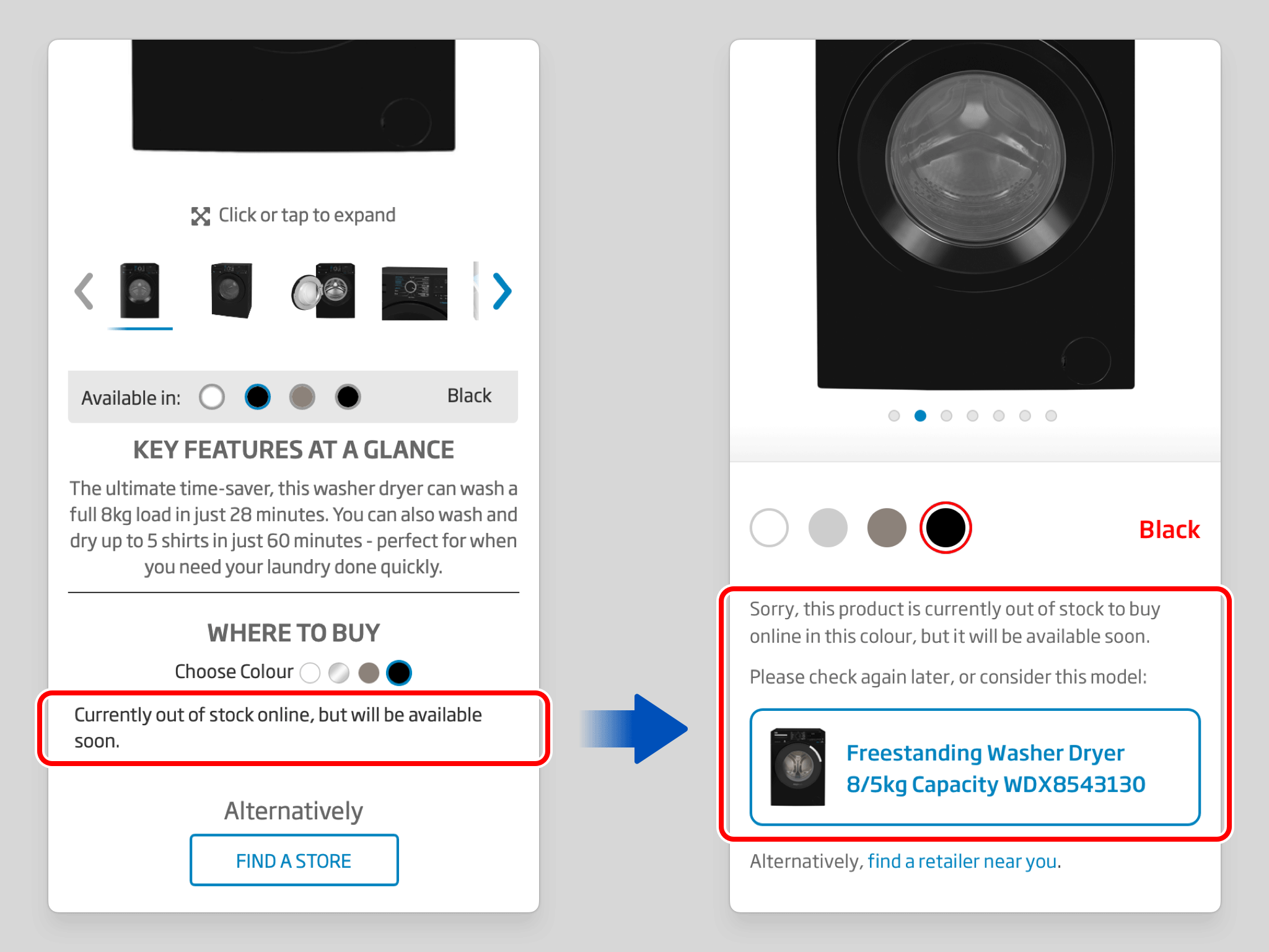
Out-of-stock states previously offered little more than a dead end. The redesign makes unavailability explicit — and, more importantly, pairs that message with a proactive suggestion: an equivalent model in the same colour, positioned as the natural next step. The user stays on the site, their intent is met with a helpful alternative, and the outcome remains constructive rather than dismissive.
The “Find A Store” option has been demoted from a button to a text link — a small change that accurately reflects its relative significance. In the previous design it sat at the same visual weight as the purchase options, implying a parity that was never warranted. Locating a physical store is a secondary behaviour; the design now communicates that clearly.
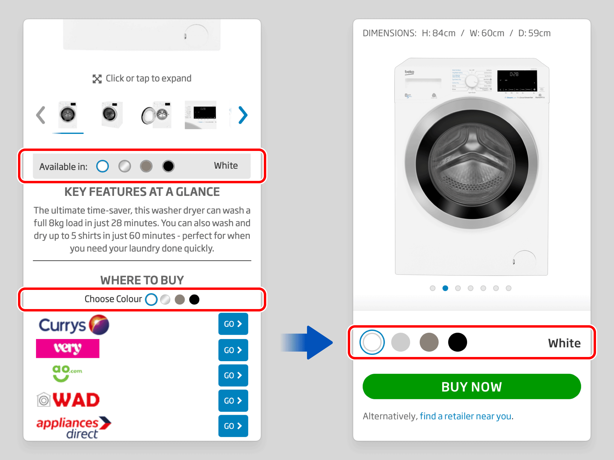
Two separate colour selectors — one governing the Gallery, one governing the Buy section — have been consolidated into a single control that manages both simultaneously. The duplication previously created a disjointed experience, obscuring the direct relationship between the variant being viewed and the one being purchased.
The product description has been repositioned above the image gallery and purchase sections, removing the visual break it previously introduced between them. The connection between seeing a product and acting on that interest is now uninterrupted. The eye moves naturally from image to purchase option without being redirected through unrelated content.
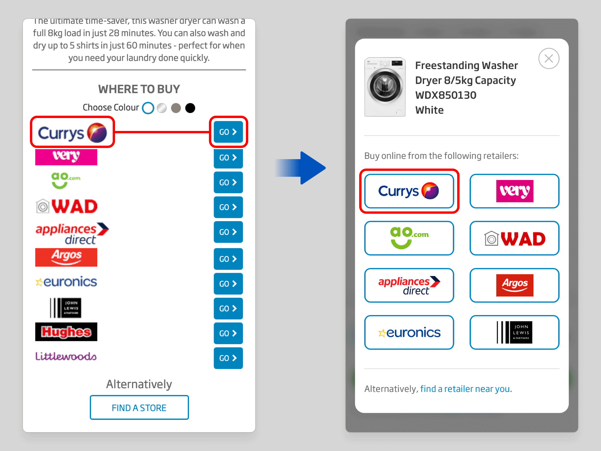
Within the retailer modal, each retailer's logo and its corresponding action button have been merged into a single interactive element. Previously, a row of logos paired with a separate column of “Go” buttons created unnecessary duplication and a weak link between brand and intent. The consolidated treatment makes both the association and the action immediately legible.
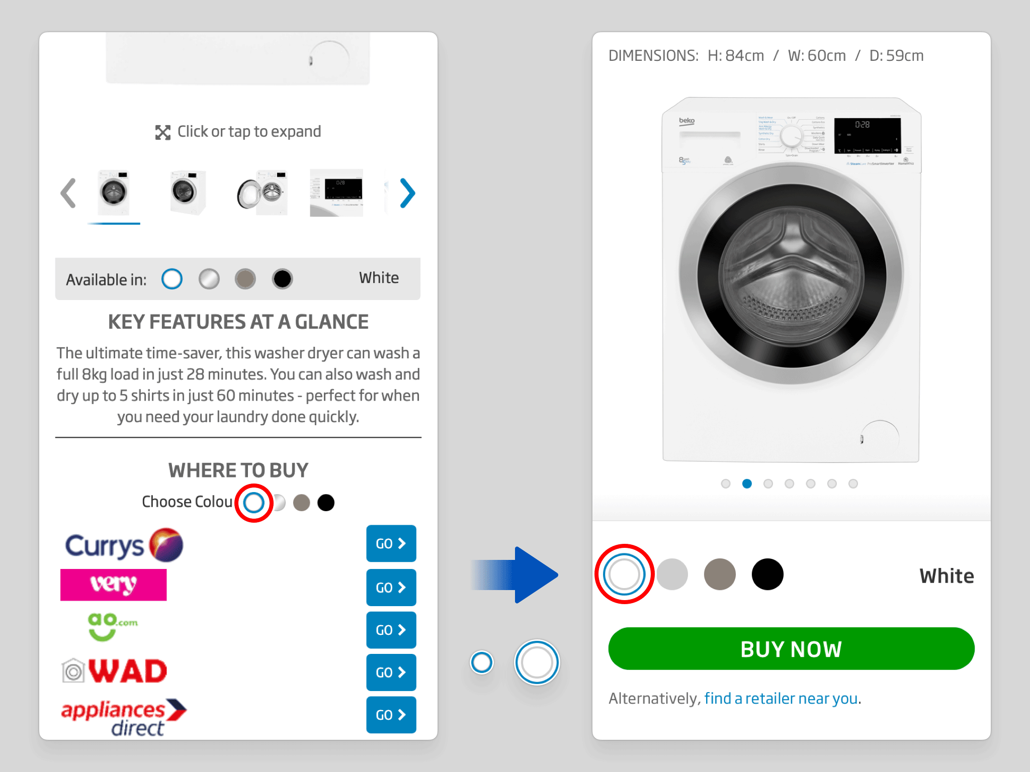
Colour selector swatches have been enlarged to meet established tap-target guidelines for touchscreen devices. The previous dimensions made accurate selection unnecessarily difficult on mobile — a source of quiet friction that has been resolved with a straightforward but meaningful adjustment.

As the user scrolls past the BUY NOW button, it transitions into a sticky position, pinned to the top of the viewport — keeping the option to purchase visible throughout the entire browsing experience. Readiness to act is never met with the need to scroll back to find it, satisfying both the customer’s needs and the retailer’s wishes.

UX/UI • App • Prototyping
UX/UI • Website • Case Study

Motion Design • Marketing • Audio Editing

UX/UI • Website
Motion Design • Marketing • Illustration
Game • Illustration • Animation • UX/UI • Case Study

UX/UI • App • Motion Design • Prototyping

Game • Illustration • Animation • UX/UI

Marketing • UX/UI • Motion Design • Audio Editing
UX/UI • App • Case Study

Marketing • Motion Design • Illustration • Audio Editing
Case Study • UX/UI • Marketing • Website
Case Study • UX/UI • Prototyping • Motion Design • Audio Editing
UX/UI • App

Marketing • Illustration

UX/UI • Website • Prototyping • Marketing
UX/UI • Website
UX/UI • Illustration • Marketing • App • Game
This is just a small selection of my work. Please contact me if you wish to see more.
